a5wcb_circularProgressBuilder Function
Syntax
dim settingsJSON as C = a5wcb_circularProgressBuilder([C json [, C ph [, L flagPromptForDiv [, C controls ]]]])
Arguments
- jsonCharacter
JSON object containing the settings for the builder. The settings in this object will overwrite the default settings for the builder.
- phCharacter
Internal use only
- flagPromptForDivLogical
Internal use only
- controlsCharacter
Internal use only
Returns
- settingsJSONCharacter
Returns the properties set in the builder as a JSON string.
Description
Opens the Circular Progress Indicator Genie.
Discussion
The display of the progress indicator is highly configurable. For example, you can:
- Set the color of the 'completed' section of the bar. You can create a complex color definition that automatically uses different values for the color depending on the completed value
- Set the color of the 'uncompleted' section of the bar
- Set the size of the control
- Set the width of the control
- Indicate if the value should be shown in text in the center of the control
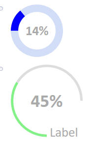
- Specify the start angle for the start and end value. In the examples shown below, the first control starts at -90 degrees and ends at 270 degrees and the second example shown below starts at -180 degrees and ends at 90 degrees.
- Specify if the control has a label. In the second example shown below, the label is 'Label'.
The genie helps define the appearance of the circular progress indicator. It includes a button to generate the JavaScript to display the control.
To run the genie, go to the Interactive Window and type:
a5wcb_circularProgressBuilder()
This will display the builder. You can set properties, see how the control will look and then when you are done, click the Show Javascript button to generate the settings and the Javascript.
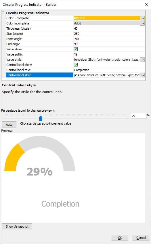
The excerpt from the Xbasic Interactive window below shows the JSON returned by the function using the default properties:
? a5wcb_circularprogressbuilder()
= {
	"v": {
		"color": {
			"complete": "#83f187",
			"incomplete": "#ddd"
		},
		"thickness": 40,
		"size": 250,
		"start": -180,
		"end": 90,
		"label": {
			"show": true,
			"suffix": "%",
			"style": "font-size: 28pt; font-weight: bold; color: #aaa;"
		},
		"additional": "",
		"__controlLabel": {
			"show": false,
			"text": "Label",
			"style": "position: absolute; left: 50%; bottom: 2px; font-size:20pt; color: #aaa; line-height: 20px; padding-left: 6px; white-space:nowrap;"
		},
		"ph": "",
		"control": ""
	},
	"settings": "{\r\n\t\"color\": {\r\n\t\t\"incomplete\": \"#ddd\",\r\n\t\t\"complete\": [\r\n{\r\n\t\"val\": 100,\r\n\t\"color\": \"#83f187\"\r\n}]\r\n\t},\r\n\t\"thickness\": 40,\r\n\t\"size\": 250,\r\n\t\"start\": -180,\r\n\t\"end\": 90,\r\n\t\"label\": {\r\n\t\t\"show\": true,\r\n\t\t\"suffix\": \"%\",\r\n\t\t\"style\": \"font-size: 28pt; font-weight: bold; color: #aaa;\"\r\n\t},\r\n\t\"additional\": \"\",\r\n\t\"ph\": \"\",\r\n\t\"control\": \"\"\r\n}"
}