Customization
Description
Customize update settings.
Submit button label
Specifies the label of the submit button.
Submit button in-line style
Specify the in-line style for the Submit button.
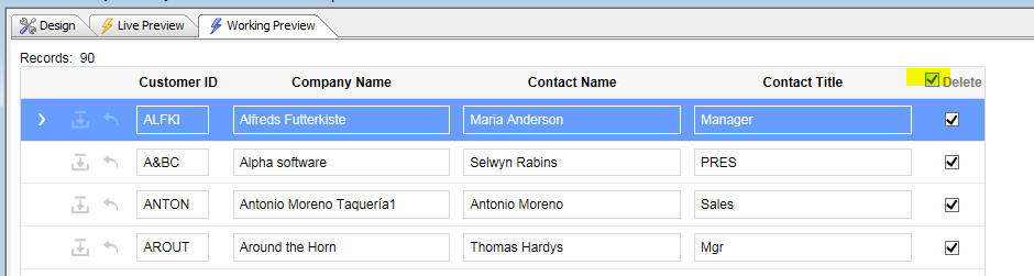
Delete record control
Defines the control used to delete records. The delete record control can be a checkbox or an icon. The control is added to each row in the Grid. If 'None' is chosen, you must put a Delete Record control in the freeform edit region of one of the cells in the Grid using this syntax:
{controlDef.system.Delete}Delete check box label
Specifies the label of the delete check box.
Allow 'delete-all' checkbox
If checked, a checkbox will be displayed next to the Delete checkbox label in the Grid header. The checkbox can be used to select or unselect the delete checkbox in every row on the current page of the Grid.
Has 'Cancel' button
Specifies whether the grid has a cancel button.
Cancel button label
Appears if Has Cancel button is selected. Specifies the label of the cancel button.
Cancel button in-line style
Specify the in-line style for the Cancel button.
Confirm before submit
Specifies whether the user must confirm changes before they are submitted.
Confirm message
The message displayed in the confirm message box.
Target page
The next page to display if the update is successful. Clicking the button next to the Target page property will display the Specify Target Page dialog. The Target page can be a specified full URL, return to 'this' page, or a .A5W or .HTML page from your project. Make a selection and click OK. The target page will appear if the update is successful.
Auto-increment field label
The value shown for auto-increment fields when entering new records. The default is "Auto".