Editing Properties
- Field validation setting
- Row Edit Style
- New Records Edit Style
- Hide new record row after insert
- New records button label
- One edit row at a time
- Lazy edits
- Allow individual rows to be saved
- Allow update if any row has error
- Error style
- Error icon
- Video
- Error messages popup-window title
- Error messages popup-window style
- Row refresh method after edits
- Refresh data on row dirty
Description
The behavior of new record rows, display of validation error messages, submission rules, and other update settings can be configured in the Grid component's Editing Properties.
Field validation setting
The Field validation setting defines how validation should be applied to records when they're updated. Field validation can be applied in one of two ways:
- All Fields
Every field is validated when the record is saved.
- Dirty Fields Only
Only the fields that have been modified are validated.
To learn more about validating fields in the Grid, watch the video below:
Data Validation
The Grid component has exceptionally strong data validation features. This video demonstrates the validation features available, including Data validation rules, Data validation using custom Xbasic at the field level, Data validation events, and automatically honoring Field Rules for DBF tables.
Row Edit Style
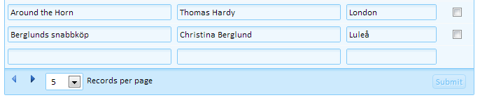
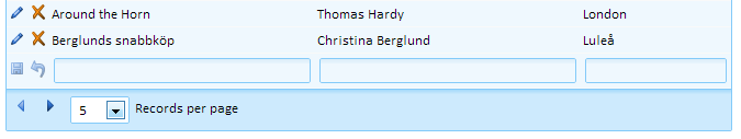
The Row edit style property comes with two options, AllRows and RowOnDemand . Selecting the 'AllRows' option will cause an updatable grid to open with all rows in edit mode. Selecting the 'RowOnDemand' option will open the grid in view mode. A row can then be placed into edit mode either by clicking the 'Edit row' icon, or by double clicking on a field. If you double click on a field, initial focus will be on the field.
With the 'Edit On Demand' option, the Grid is shown as using labels for each control. You can then double click on a field, or click the Edit icon, to turn that row into edit mode. You can specify if more than one row at a time can be in edit mode. If only one row is allowed in edit mode at a time, then when you put another row into edit mode, the row that is currently in edit mode is turned back into view mode.
 All rows are editable (V9 and older style)
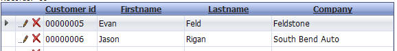 Grid rows are editable on demand
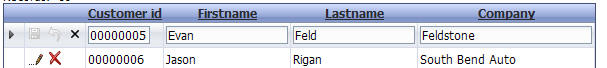 Row 1 of the Grid has been put into edit mode
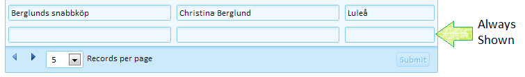
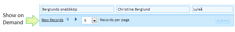
New Records Edit Style
The New records edit style property has two options: AlwaysShown and ShowOnDemand. The first, AlwaysShown, always shows a row for entering a new record in an updatable grid. The second, ShowOnDemand, creates a link that replaces the edit row. Clicking the link will reveal or hide the new record row on demand.
Hide new record row after insert
If checked, the new record rows will be hidden after inserting new records. To add another new record after submitting the new records back to the server, they will need to click the 'Edit new record' link.
This option is only available if New records edit style is set to "ShowOnDemand".
New records button label
Defines the text shown for the 'Edit new record' link. Clicking the link toggles the display of the new record rows.
This option is only available if New records edit style is set to "ShowOnDemand".
One edit row at a time
The One edit row at a time property appears when the Row edit style property is set to "RowOnDemand". If this is checked, it will allow only one row at a time to be in edit mode. Multiple rows can be placed in edit mode if this is not selected.
Lazy edits
If Lazy edits is enabled, an Ajax callback will not be made when a row is put into edit mode. This makes it quicker to switch to edit mode. If Refresh data on row dirty is checked, however, an Ajax Callback will be made when the user starts editing a row to refresh the data.
This option is only available if Row edit style is set to "RowOnDemand".
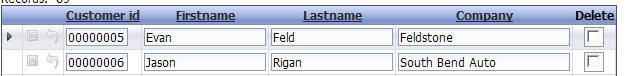
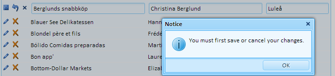
Allow individual rows to be saved
If this option is checked, a the "Row Status" column will be added. The Row Status column contains icons that can be used to save and undo changes to individual rows.
Allow update if any row has error
If any row has a validation error (determined by executing the CanUpdateRecord or CanDeleteRecord event), the update will not be executed if Allow update if any row has error is not checked. If it is ok to commit records, even if some records have errors, check this option. The records with errors will not be submitted to the system of record, however rows without errors will be saved back to the data source.
Error style
The Error style defines how field validation errors are displayed.
- Block
Under the field
- Inline
Next to the field
- Tip
Popup error when hovering over the field with the mouse.
- Icon
Display an error icon showing the error when the mouse is hovered over the icon.
- Global
Display all errors in a single location.
Classname - field with error
The class name of the control that contains the error. Leave blank to use the default class.
Classname - error message
The class name of the element that contains the error message. Leave blank to use the default class.
Classname - field with error message when hovering over error message
Defines the class name to apply to the control corresponding to an error message when the mouse is hovered over the error message or over the control with the error.
This option is only available when the Error style is set to "Global".
Classname - error message (on hover over error message)
Defines the class name to apply to an error message when the mouse is hovered over the error message or the corresponding control.
This option is only available when the Error style is set to "Global".
Error icon
Defines the icon to show next to a field if it has a validation error. To use a built-in image, use the syntax:
images/BuiltInImageName.png.a5image
The Error icon setting is only available when the Error style is set to 'Icon'.
Video
Show Row Errors in a Pop-up Window
By default, when you submit a Grid and the server determines that there are errors in the data, the errors are either shown next to the field(s) that have errors, or in the case of 'row-level' errors, the errors are shown by turning on an error icon in the row selector, which the user can then hover over with the mouse to see the actual error text.
This works well if the Grid has a tabular display. But in the case where the Grid is formatted as a Form, if the form has a large number of fields, the error icon can be too subtle and is easily overlooked. A new option allows you to display 'row-level' errors in a pop-up window.
Error messages popup-window title
The title for the error message popup window. This option is only available if Show row errors in popup-window is checked.
Error messages popup-window style
In-line styles for the error message popup window. This option is only available if Show row errors in popup-window is checked.
Row refresh method after edits
When data is updated, deleted, or inserted, the Grid component must be refreshed to reflect the changes. The Row refresh method after edits property configures what is refreshed. The following options are available:
- AutoSelect
Let Alpha Anywhere choose how to refresh the Grid.
- FullPage
Refresh all records in the Grid. This method is the slowest, but guarantees that summary fields and linked records are refreshed.
- SingleRow
Only refresh the data for the row that was edited.
- Minimal
This is the fastest option. Use this option if you do not have any summary or calculated fields. If you have summary fields, use a different method as "Minimal" will not update summary fields.
Refresh data on row dirty
If checked, an Ajax Callback will be made to the server to refresh the row data when the user starts to edit a record.