UX Controls
Description
The UX component contains a large number of different types of controls. Each of these controls comes with its own advantages as well as its own sets of properties. Some of these properties are shared across controls while others are specific to a given control type. This page contains links to the different groups of controls available in Alpha Anywhere as well as a link the Control Properties pages. If you are looking for guides on how to assemble working controls, populate controls with data, or see what a given property in a control's Properties list then this is a good place to start.
- Name
- Description
- Data Controls
Data Controls are controls used to create interfaces for manipulating and editing data from a data source (e.g. SQL database, web service, static data, etc.)
- Panels
Panels present a convenient way for organizing mobile applications. The controls that make up an application are placed inside Panel Cards. If Panel Cards are placed inside a Panel Navigator, then users can move through the Panel Cards by swiping their mobile device and/or pressing specified buttons. When placed in a Panel Layout, both Panel Navigator containers and Panel Cards can be designed to appear on the same screen.
- Containers
Containers, Free-form Layouts, Tab Control.
- Other Controls
FormView, ControlBar, Placeholders, Comments, Static Text, and other controls that are not Data Controls, Panels, Containers, or Pre-defined controls.
- Defined Controls
Defined controls are controls whose functionality has largely been pre-defined. They are ready to use as soon as they are added to a component.
- Additional Options Menu
The toolbar in the UX Controls page contains a 'Menu' dropdown list with a number of useful tools and options.
- Control Properties
When you add a control to a UX component on the control page, that control comes with a number of general property settings. These will appear in the properties list on the right side of the screen. Some controls, like the list control, come with additional builders. The control properties are different from the general UX properties, that are defined on the [UX Properties] page.
Introducing the UX Controls Page
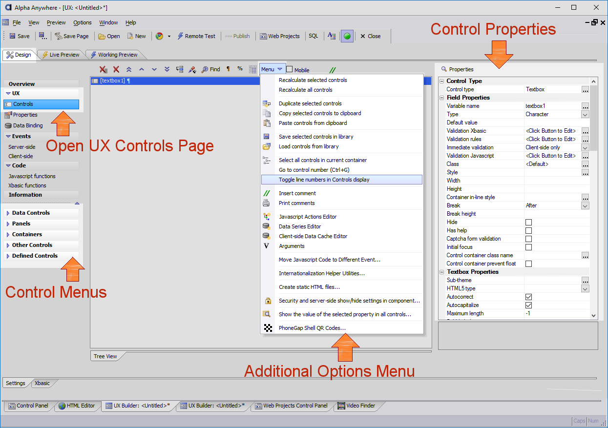
The lower left-hand corner of the UX Controls page contains the menus for the Data Controls, Panels, Containers, Other Controls, and Defined Controls. The links shown above, will open guides relating to the controls contained in each of these menus. The toolbar in the UX Controls page also contains a menu known as the "Additional options menu". The link to this menu contains pages describing how each of the options in the additional options menu can be used. The "Control Properties" links displays the groups of property settings for all of the available controls and containers on the Controls page. 'Control Properties' are the properties that are displayed on the left-side of the Controls page whenever an added control is highlighted in the controls tree.
UX Controls Toolbar

Delete all of the controls.

Delete. Highlight and delete a control from the control list

Move to top. Move a control to the top of the control list

Move up one row. Move a control one row up in the control list

Move down one row. Move a control down one row in the control list.

Move to bottom. Place a control at the end of the control list.

Move to a specified location. Place a control in a specific row in the control list.

Paste current property value. Copies the properties from one control and allows users to paste these property settings on to multiple controls.

Find a Control. Search for a control.

Toggle break. When the component is run, a toggle places the next control in the control list underneath the control with the toggle break.

Set control width to a percentage value. The control width will take up a set percentage on the screen when the component is run.

Toggle display of line numbers in the Tree View.

Additional options menu

Mobile device simulator

Layout Error. Appears when there is a problem with the way controls appear in the UX component.

Show comments for current control
Index of Controls and Properties
- Button List
- Calendar
- Chart
- CheckBox
- CustomControl
- Dropdownbox
- Hidden
- Image - Data Bound
- Ink
- Label
- List
- Map
- More...
- QRCode
- RadioButton
- SignatureCapture
- Slider
- Spin List
- Switch
- Textbox
- Textarea
- Tree
- ViewBox
- Delete Record
- Editor-Camera
- Editor-DateSpinLists
- Editor-Ink
- Editor-List
- Editor-TextBox
- JS Command Window
- List-Debugging info
- List-Detail View-Buttons
- List-Search Part-Buttons
- UX-Local Storage Management
- List Menu
- List-Navigation Buttons
- List-Navigation Icons
- List-Page number
- List-Page selector
- List-Record count
- List-Selector
- Login-Logout
- New Record Button
- Record Navigation Button
- Record Navigation Icons
- Row Number
- Submit-Reset
- Update Source Grid
- Button
- Comment
- CustomControl
- Embedded Object
- FileUpload/Download
- Form View
- Hyperlink
- IFrame
- Image
- Spacer
- Static Text
- TabStop
- Placeholder
- VideoPlayer
- Client-side Properties
- Component Definition
- Container Properties
- Custom Control (Data Bound)
- Data Control Properties
- Button List Properties
- Button List Styling
- Chart Properties
- Checkbox Properties
- Control Type
- Data Binding
- Date/Time Picker Properties
- DropDownBox Properties
- Field Label
- Field Properties
- Ink Properties
- Label Properties
- List Properties
- Lookup
- Map Control Javascript
- Map Properties
- RadioButton Properties
- Signature Capture Properties
- Slider Properties
- Spin List Properties
- Switch Properties
- TextArea Properties
- Textbox Properties
- Tree CSS
- Tree Javascript
- Tree Properties
- ViewBox Properties
- Image Properties
- Javascript
- Javascript - Touch, Mouse, Pointer Events
- Other Control Properties
- Button Appearance
- Button Properties
- Comment Properties
- Control Label
- ControlBar Properties
- Custom Control Properties
- Embedded Object Properties
- File Upload - Download Properties
- Form Properties
- Hyperlink Properties
- IFrame URL
- On-Page Window Properties
- Optimization (PhoneGap-Static HTML)
- Placeholder Properties
- Spacer Properties
- Static Text Properties
- Video Player Properties
- Panel Properties
- Repeating section
- Security
- Show-hide/Server-side