Web Theme Builder
Description
The Web Theme Builder (also referred to as the Stylesheet Builder, Style Builder, or Web Style Builder within Alpha Anywhere) is used to create and modify Web Themes, which are used to style applications in Alpha Anywhere
Discussion
Alpha Anywhere Web Themes are defined using Sass syntax.
One huge advantage of Sass syntax is the ability to define variables for many of the setting in the stylesheet, especially colors. The Web Theme Builder allows you to adjust variables as well as modify and extend styles with additional classes, sub-themes, and more.
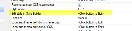
There are several ways to get to the Web Theme Builder. The easiest is to open the UX or Grid component and click the  smart field button for Edit style in Style Builder property. This will open the Web Theme Builder for the style used by the component.
You can also select the Edit > Open Web Style Builder command from the menu when the Web Control Panel has focus to open the Web Theme Builder. When opened from the Web Projects Control Panel, you will be prompted to select an existing theme. If you choose to open a system style, Alpha Anywhere will prompt you to create a copy of the style prior to opening the Web Theme Builder. If you select a local or global style, the style will be opened without any additional prompts.
Customizing Web Themes
The Web Theme Builder can be used to edit the following file types:
- Style Tweaks
- Inherited Styles
- Sass Styles
The Web Theme Builder can be used to edit style tweaks, an Inherited style, or a Sass style. The Title bar in the Web Theme builder will indicate what type of file you are editing.

Where are Styles Stored
Style Tweaks
Style Tweaks are stored in the web root inside the css/StyleTweaks folder and are applied after the Sass style that they modify has been loaded. If a Web Theme has been tweaked, a folder of the same name as the style will found in the StyleTweaks directory containing a styleTweaks.json file. Do not edit the tweak file directly. Instead, use the Web Theme Builder or the Style sub-theme and CSS 'tweaks' property in the UX Component.
For more information, see Style Tweaks.
 The Title bar for a Style Tweak.
Inherited Styles
Inherited Styles are either stored locally (the css folder in the web root) or globally (in the Shared Resources directory -- see Sass Styles below for more details) inside a folder with the same name as the Inherited style. Inside the style folder, you will find a styleInherit.json file. Do not edit the Inherited style files directly. Instead, use the Web Theme Builder.
For more information, see Inherited Styles.
The Title bar for an Inherited Style.Sass Styles
Sass Styles are similar to CSS styles -- which were used in prior versions of Alpha Anywhere. They differ from CSS styles in that they allow the use of Sass markup. They are be stored in one of three places::
- Location
- Description
- system
Styles are stored in the CSS folder in the executable folder -- these styles cannot be directly edited. If you want to edit a 'system' style, you must first make a 'local' or 'global' copy of the style. You will edit the copy of the style.
- local
Styles are stored in the CSS folder in the Web Project folder
- global
Styles are stored in a special folder that is visible to all web projects in your Workspace. The folder is called "Shared Resources" and is found in the "WebProjects" directory. For example, if your workspace is called "MyWorkspace", the global styles for the workspace would be found inside the "MyWorkspace.WebProjects/Shared Resources" directory.
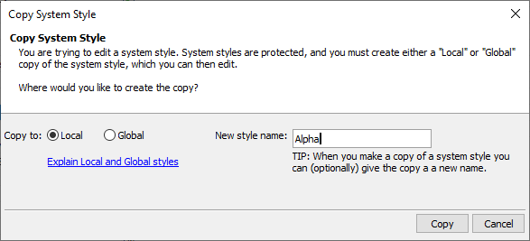
If you try to edit a system style, you will be asked to make a copy of the style and save it as either a 'local' or 'global' style.
When you make a copy of the style you can keep the same name as the source ('system') style, or you can give the style a new name. Since the local or global style is stored in a different folder than the system style, it is perfectly OK to use the same name as the source ('system') style. Be aware that if two styles of the same name exist, the most local style will be used -- e.g. a local style named 'Alpha' will be used in lieu of the 'Alpha' system style.
You can also create styles from scratch. This is done from within the Web Theme Builder using the File > New Style menu option. This will create a blank style that only contains the "General" part of the theme. Use the Select Part... dropdown to add the parts to your theme that you would like to style. Any part that is not defined will have no styling.

The Web Theme Builder Layout
The Web Theme Builder has two distinct modes:
- Mode
- Description
- Adjust
Where you can adjust the Sass variables used in the style and preview the entire web theme.
- Code
Where you can directly adjust the Sass and CSS for the style and create new 'sub-themes' for different control types.
The tabs at the top on the screen allow you to switch between Adjust mode and Code mode.
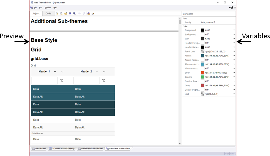
Adjust Mode
The Adjust mode allows you to easily adjust the Sass variables in the style. For example, if you use the built-in Alpha stylesheet you will see that the predominant color in the style is a bright blue. By changing a single Sass variable, such as the Accent color, you can change the entire theme.
 Adjust Mode. The Accent Color has been changed to a darker blue.
Code Mode
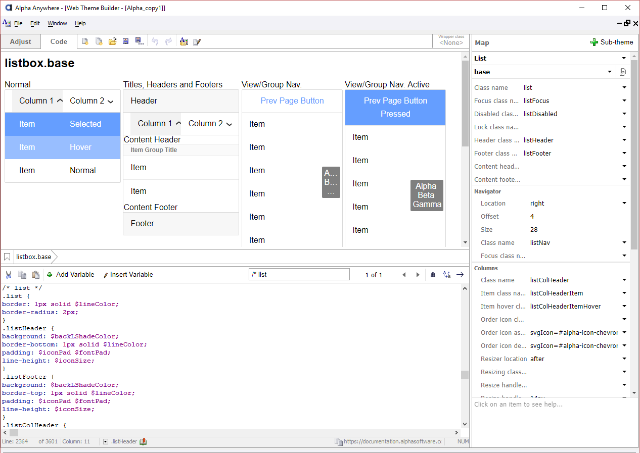
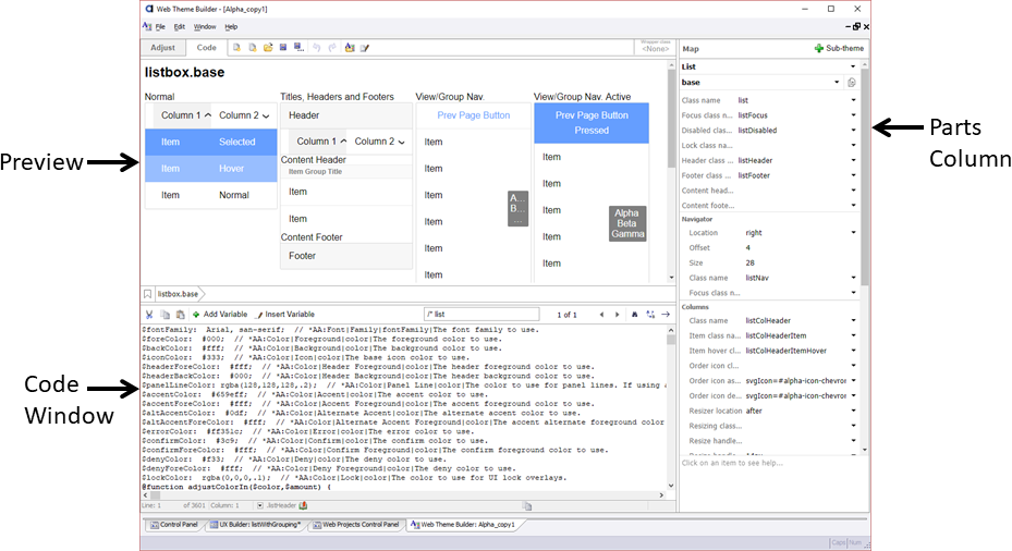 Code Mode. The List part's base sub-theme is selected.
In Code mode the left side of the screen has a preview of the selected part on the top and the Sass/CSS on the bottom.
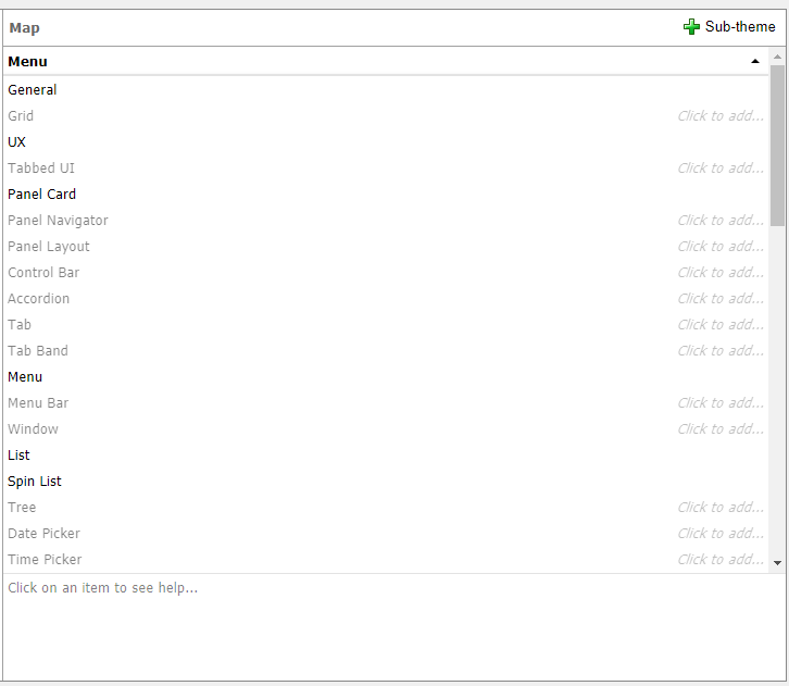
The column on the right shows all of the "parts" defined in the stylesheet. Examples of "parts" include Edit, Button, Accordion.
For each object type one or more named sub-types can be defined. The sub-types are called 'sub-themes'. Generally, every "part" has at least one 'sub-theme' called 'base'. In the styles that ship with Alpha Anywhere, some parts only have a 'base' sub-theme. You can add as many sub-themes as you like to any part. Note that not all parts have a "Sub-theme" property available for setting the part's sub-theme.
A sub-theme defines all of the CSS class names, icons, sizes, etc used to style the object.
If you create a style by copying a system style, you will find a list of Sass variables located at the top of the Code window. You can adjust the variable values directly in the Code window or you can switch to Adjust mode to change the Sass variables.
Web Theme Parts
Alpha Anywhere Web Themes are broken into "Parts". Parts refer to style implementations for Components, controls, or general settings for the entire style sheet. Each part can have one or more sub-themes. Most Parts representing Controls must implement the "base" sub-theme, which is the default sub-theme applied unless otherwise specified using the sub-theme property for a control.
The "General" part does not support sub-themes. This is because General is used to configure settings specific to the Web Theme.
The Web Theme Parts are listed below.
General
General settings for the entire theme. Includes options for general text styling and icons. Cannot be sub-themed.
 Preview of General part for the Alpha web theme.
Grid
Styling, icons, and other customizations that control how the Grid is rendered.
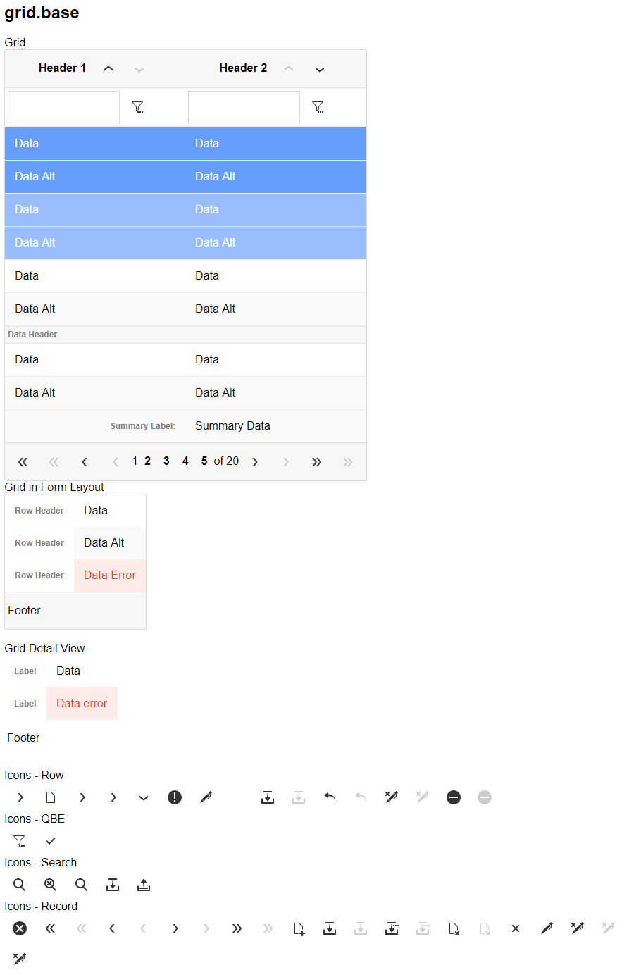 Preview of Grid part's base sub-theme for the Alpha web theme.
UX
Styling, icons, and other customizations that control how the UX is rendered. Includes styling for Repeating Sections.
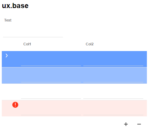 Preview of UX part's base sub-theme for the Alpha web theme.
Tabbed UI
Styling, icons, and other customizations that control how the Tabbed UI Component is rendered.
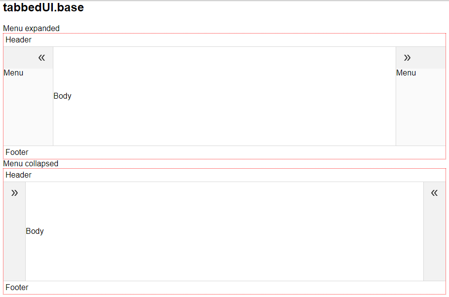 Preview of Tabbed UI part's base sub-theme for the Alpha web theme.
Panel Card
Styling for the UX Component's Panel Card, including the panel header, body, and footer.
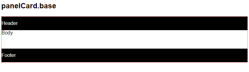 Preview of Panel Card part's base sub-theme for the Alpha web theme.
Panel Navigator
Styling for the UX Component's Panel Navigator, including the Panel Navigator's header, body, and footer as well as the Indicator shown at the bottom of the Panel Navigator that indicates the current active panel.
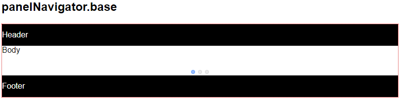 Preview of Panel Navigator part's base sub-theme for the Alpha web theme.
Panel Layout
Styling for the UX Component's Panel Layout, including the Panel Layout's header, body, and footer. Styling for the layout orientations -- left-to-right, right-to-left, top-to-bottom, bottom-to-top, and flow locked -- are specified in the Panel Layout part.
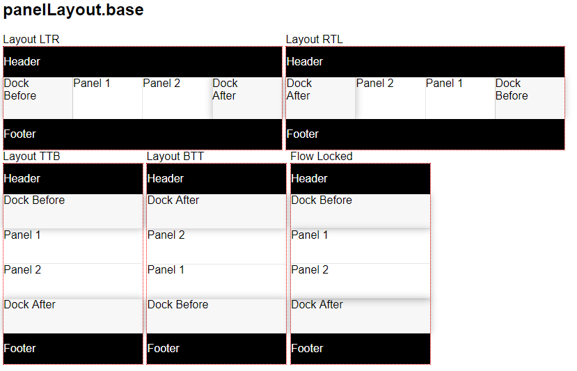 Preview of Panel Layout part's base sub-theme for the Alpha web theme.
Control Bar
Styling for the UX Component's Control Bar Control, including disclosures.
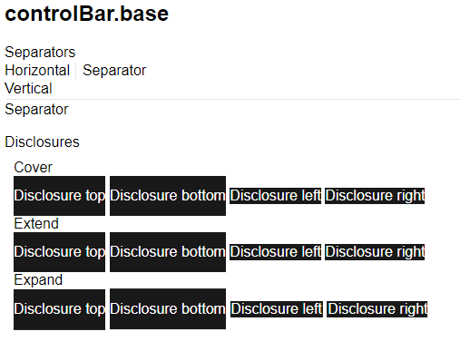 Preview of Control Bar part's base sub-theme for the Alpha web theme.
Accordion
Defines the style for the accordion control, including the pane titles and title state (selected, disabled).
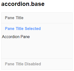 Preview of Accordion part's base sub-theme for the Alpha web theme.
Tab
Styling for the tab and tab pane for tab controls.
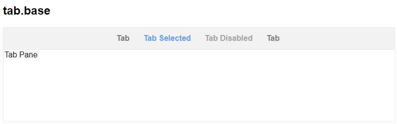 Preview of Tab part's base sub-theme for the Alpha web theme.
Tab Band
Styling for tab bands. Tab bands are used with the Panel Navigator when the Panel Navigator has been configured to display a Tab Band for navigation.
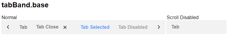 Preview of Tab Band part's base sub-theme for the Alpha web theme.
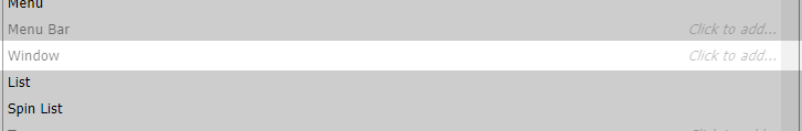
Menu
Styling for menus, including labels, icons, hover and selected behavior, cascading, and pointers.
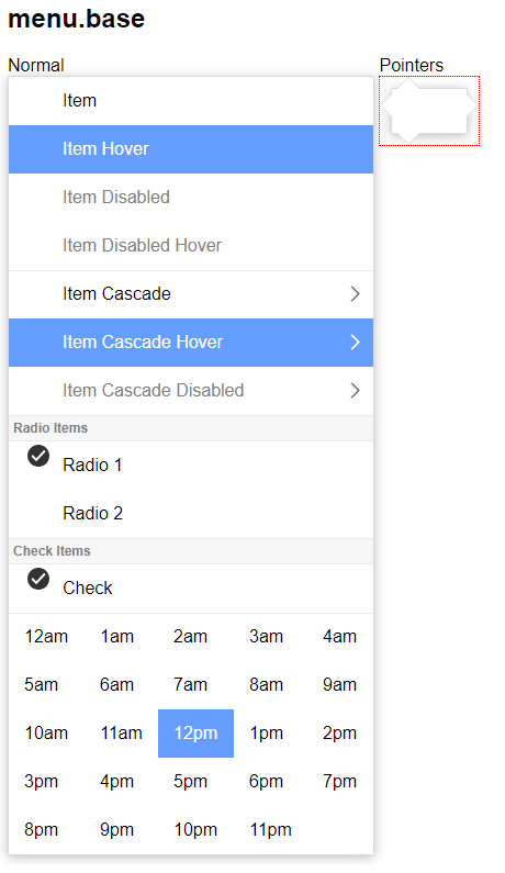 Preview of Menu part's base sub-theme for the Alpha web theme.
Menu Bar
Styling for the horizontal menu bar.
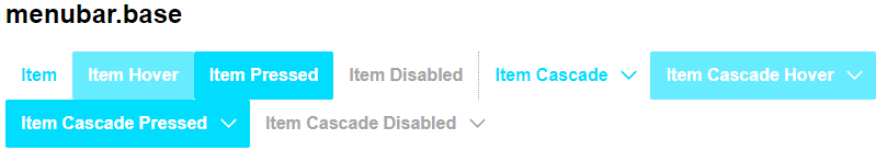 Preview of Menu Bar part's base sub-theme for the Alpha web theme.
Window
Styling for popup widows. Includes ability to customize the header, footer, wrapper class for the button bar, and more.
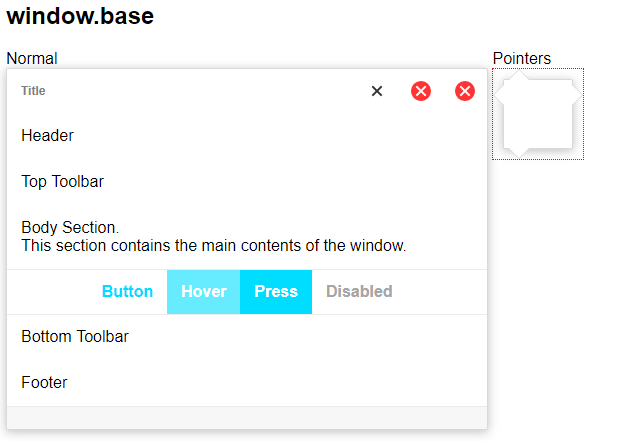 Preview of Window part's base sub-theme for the Alpha web theme.
List
Styling for the UX Component's List Control. This includes classes for some of the pre-defined list templates.
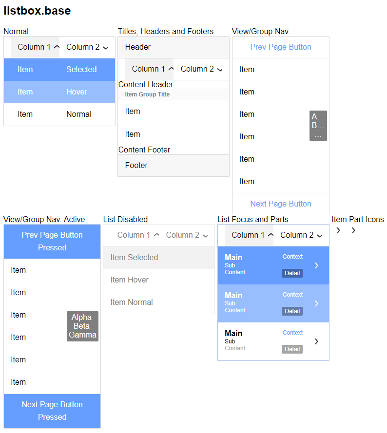 Preview of List part's base sub-theme for the Alpha web theme.
Spin List
Styling for the Spin List control, including items and disabled state.
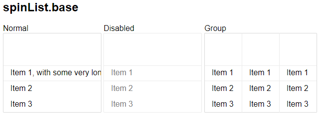 Preview of Spin List part's base sub-theme for the Alpha web theme.
Tree
Styling for the tree control. You can customize the class names and images used for branch and leaf nodes.
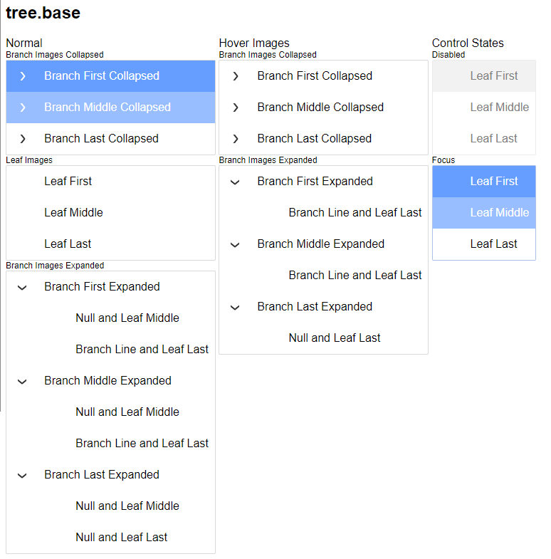 Preview of Tree part's base sub-theme for the Alpha web theme.
Date Picker
Styling for the Date Picker, including both the calendar and navigation portions of the control. The Date Picker is displayed when selecting a date for a Textbox control configured to use a Date Picker.
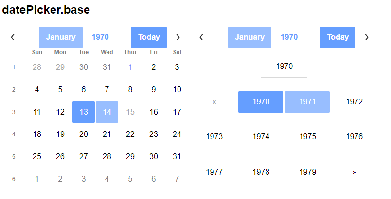 Preview of Date Picker part for the Alpha web theme.
The Date Picker does not support sub-themes at this time.
Time Picker
Styling for the Time Picker. The Time Picker is displayed when selecting the time for a Textbox control configured to use a Time picker.
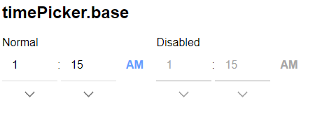 Preview of Time Picker part for the Alpha web theme.
The Time Picker does not support sub-themes at this time.
Ink
Styling for the UX Component's Ink Control, including icons.
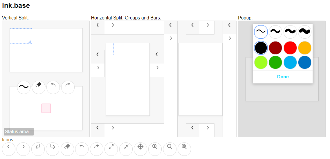 Preview of Ink part's base sub-theme for the Alpha web theme.
Edit
Styling for Textbox and Textarea controls.
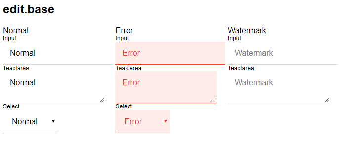 Preview of Edit part's base sub-theme for the Alpha web theme.
Edit Button Group
Styling for Textbox controls that contain in-control buttons.
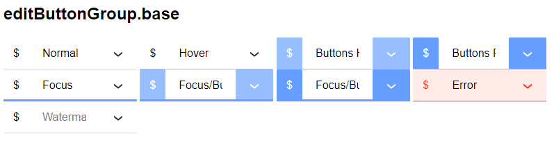 Preview of Edit Button Group part's base sub-theme for the Alpha web theme.
Button
Styling for buttons. Can specify the normal, hover, pressed, and disabled states.
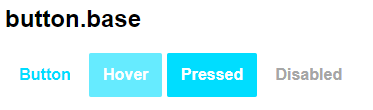 Preview of Button part's base sub-theme for the Alpha web theme.
Button Dropdown
Styling for button dropdown controls. Includes the basic options for styling a button as well as the dropdown location, icons, and optional HTML to include after the icon.
 Preview of Button Dropdown part's base sub-theme for the Alpha web theme.
Button Split
Styling for split buttons. Includes the basic options for styling a button as well as the split location, icon, and optional HTML to include after the icon.
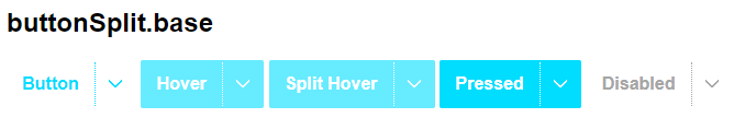 Preview of Button Split part's base sub-theme for the Alpha web theme.
Button List
Styling options for a button list. Separate class names are applied to the first, last, and middle buttons of a button list.
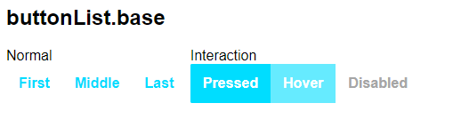 Preview of Button List part's base sub-theme for the Alpha web theme.
Slider
Styling for the slider control, including the handles and range bar.
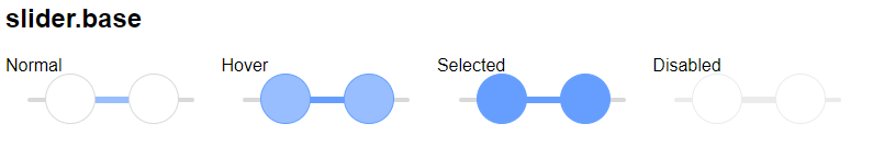 Preview of Slider part's base sub-theme for the Alpha web theme.
Switch
Styling for the switch control. You can specify class names for the switch button as well as the On and Off state.
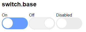 Preview of Switch part's base sub-theme for the Alpha web theme.
Drag Scrolling
Styling for the horizontal and vertical scrollers shown when scrolling a panel or other control.
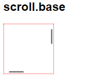 Preview of Drag Scrolling part's base sub-theme for the Alpha web theme.
Scroller
Styling for the List Control's Scroller. Includes settings for the normal, active, and dial states for both vertical and horizontal scrollers.
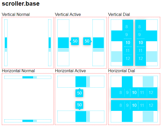 Preview of Scroller part's base sub-theme for the Alpha web theme.
Parts that do not have an implementation will appear greyed out in the Web Theme Builder.
In a Style Tweak or Inherited Theme, parts that do not have any user-defined sub-themes will appeared greyed out. When you add a Part to your Web Theme, the base sub-theme is automatically created for you.
Opening the Web Theme Builder from a Component
You can open the Web Theme Builder directly from the UX and Grid component. The Edit style in Style Builder property appears directly below the 'Style name' property.
If the web theme is a system theme, you may be prompted to create a copy of the theme before you can open it in the Web Theme Builder. System themes cannot be directly edited. Modifications to system themes can only be made by tweaking the style, creating an Inherited theme based on the system style, or by copying the system style locally to the project or workspace.
System inherited themes also cannot be directly modified and must be copied locally to make changes. If the theme you are using is a system inherited theme, you have the option to detach the theme from the base style when the style is copied. When an inherited theme is detached, all of the CSS/Sass from the base theme is copied into the new web theme.
If you do not detach the inherited theme from the base theme, only the CSS/Sass in the inherited theme will appear in the Web Theme Builder on the code tab.
Customizations to a system theme, such as selecting a color palette or creating sub-themes, are stored as style tweaks. If the web theme is a system theme that has been tweaked, Alpha Anywhere will not ask you to copy the style. Instead, Alpha Anywhere will open the style tweak in the Web Theme Builder. Style tweaks and Inherited styles do not include the full CSS/Sass of the core web theme, so it is not uncommon for the Code tab to be blank when you first open it if the only modifications that have been made to the base theme are the Adjust variables.