CheckBox PropertiesJavascript control
Description
Enables rendering a checkbox control as a "Javascript control", which allows full customization of the look of the checkbox options and gives access to JavaScript methods to manipulate the choices in the control.
Discussion
By default, the checkbox control is rendered using the HTML input control (e.g. <input type="checkbox">). The default HTML input control is difficult to customize the look and feel. It also lacks JavaScript methods for repopulating the checkbox options easily.
The Javascript control option converts the checkbox control into a JavaScript checkbox control. As a JavaScript control, Alpha Anywhere creates a JavaScript object you can use in client-side scripts to manipulate the options in the control. You also gain more options to customize how the checkbox markers are rendered.
For example, in the images below, the checkbox control has been rendered with custom SVG icons for the on and off state.

To turn on the Javascript control option, check the Javascript control property in the Property Sheet.
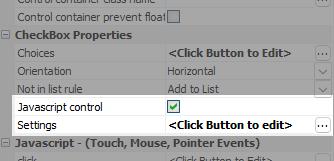
The Settings property will then be revealed. To define control settings, click the smart field.
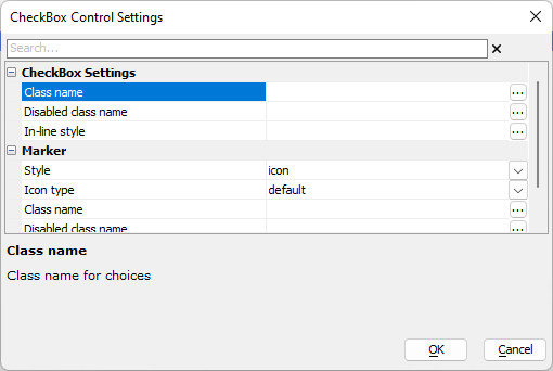
Configuring Control Settings
Once enabled, you have access to the following options to configure the control:
Class name
Optional classes to apply to the control.
Disabled class name
Optional classes to apply to the control when it's disabled.
In-line style
Optional in-line styles to apply to the control.
Configuring Marker Options
You can specify the Marker style. The option are:
Style
The control style.
- Style
- Description
- input
Checkbox is rendered using the standard HTML input control.
- icon
Checkbox is rendered using SVG icons to represent the on and off state.
- html
Checkbox is rendered using HTML text to represent the on and off state.
Icon type
Shown when Style is icon.
The Icon type defines how the marker for the checkbox control is rendered. It can use the HTML input control, SVG Icons, or custom HTML.
- Icon type
- Description
- Default
Use the default icon in a default size.
- Large
Use the default icon in a large size.
- Custom
Specify the icons and sizes to use.
Icon - on
Shown when Style is icon and Icon type is Custom.
The icon to use when the checkbox is checked.
Icon - off
Shown when Style is icon and Icon type is Custom.
The icon to use when the checkbox is unchecked.
HTML - on
Shown when Style is html.
The HTML to render when the checkbox is checked.
HTML - off
Shown when Style is html.
The HTML to render when the checkbox is unchecked.
Class name
Optional class names to apply to the checkbox marker.
Disabled class name
Optional class names to apply to the checkbox marker when it's disabled.
In-line style
Optional in-line styles to apply to the checkbox marker.
Getting the Control's JavaScript Object
To get a pointer to the checkbox's JavaScript object, use the [{dialog.object}.getControl()] method. For example:
var checkObj = {dialog.object}.getControl("CHECKBOX_1");
if (checkObj) {
    ' Object exists! Can call methods on it.
}
Once you have a pointer to the object, you can call methods on the object, such as the populate() method to repopulate the choices in the control.
The following methods are available:
- Method
- Description
- populate()
Updates the control's choices. This method can be used to replace or add the control's options.
var obj = {dialog.object}.getControl('CHECKBOX2'); if (obj) { var arr = []; arr.push({"html":"Mon","value":"1"}); arr.push({"html":"Tue","value":"2"}); arr.push({"html":"Wed","value":"3"}); arr.push({"html":"Thu","value":"4"}); arr.push({"html":"Fri","value":"5"}); arr.push({"html":"Sat","value":"6"}); arr.push({"html":"Sun","value":"7"}); var keep = false; var animate = true; obj.populate(arr,keep,animate); obj.refresh(); }- refresh()
Redraws the control. The refresh() method is usually called after repopulating the control's choices using the populate() method.
var obj = {dialog.object}.getControl('CHECKBOX2'); if (obj) { obj.refresh(); }- setDisabled()
Enables or disables the control. The control can also be enabled or disabled using the {dialog.object}.setDisabled() method.
var obj = {dialog.object}.getControl('CHECKBOX2');
if (obj) {
    if (Reflect.has({dialog.object}._myvars, 'checkEnabled') == false) {
        {dialog.object}._myvars.checkEnabled = true;
    }
    obj.setDisabled({dialog.object}._myvars.checkEnabled);
    {dialog.object}._myvars.checkEnabled = !{dialog.object}._myvars.checkEnabled;
}
See Reflect (MDN) to learn more about this native built-in JavaScript object.
- setValue()
Sets the control's value. The value can also be set using the {dialog.object}.setValue() method.
var obj = {dialog.object}.getControl('CHECKBOX2');
if (obj) {
    var value = parseInt({dialog.object}.getValue('CHECKBOX2'),10);
    value += 1;
    value = (value > 7)? 1:value;
    value = [value+""];
    obj.setValue(value);
}
A checkbox only has a JavaScript object when Javascript control is enabled.
Videos
Rendering RadioButton, CheckBox and DropDownBox as a Javascript Control
By default, the RadioButton, CheckBox and DropDownBox controls are not Javascript controls (like the List control, for example) and as such, you can't call methods on the control to repopulate the choices shown in the control. You can however specify that these controls should be rendered as Javascript controls (which will then allow the choices in the control to be set using the control's .populate() method).
In this video, we show how a RadioButton control can be rendered as a Javascript control.