Orientation
Description
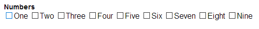
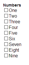
Choose how the CheckBox options are rendered: vertically, horizontally, or in mulitple columns.
Orientation determines whether the checkboxes are laid out vertically, horizontally, or in columns. If you choose the columns option, you can specify the 'snaking style'. This is either Left-to-Right-Top-to-Bottom (LRTB) or or Top-to-Bottom-Left-to-Right (TBLR).
Columns are not supported for ButtonList style.
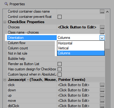
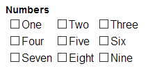
For information on formating snaking columns, watch part 2 of the videos below. The easy way to set this format is to change the Column flow property (which is also in the CheckBox Properties section).
Dynamically Repopulate a CheckBox or RadioButton Control
In some applications, it might be necessary to repopulate the choices shown in a radiobutton or CheckBox control with a new set of choices after the UX Component has initially been rendered. An Ajax callback is made where the new choices are computed on the server, then a Javascript response is sent to the browser to update the choices for the control. These videos show how this can be done.
In part 2, the CheckBox is populated with a much larger set of choices and a snaking layout (left-to-right, top-to-bottom) for the CheckBoxes is specified.